6.30.2009

The Art & Life of Abner Graboff

Recently, I had the excellent opportunity of interviewing Jon Graboff, asking him if he could enlighten us about his father, illustrator and designer Abner Graboff. Jon was gracious enough to share some fascinating stories, as well as family photos! (All photos courtesy of Jon Graboff.)

So, who was Abner Graboff? Let's find out....

Ward: First of all, there's not much out there on your father and his career. For what little I've gathered, all I know is that he worked in the commercial art world (advertising, etc.) as a designer and art director, as well as an illustrator, and then he worked on children's books. I'd love to hear about Abner's early career: how he got into art and design. Did he go to school? If so, where?

Jon: My father, the first of two sons, was born on June 28, 1919 to a couple of Russian immigrants, Joseph and Sonia, who owned and operated a laundry business in East Orange, New Jersey. Ira, his younger brother who would later become a Cooper Union educated architect, was born 6 years later.

Earliest shot of Abner with family
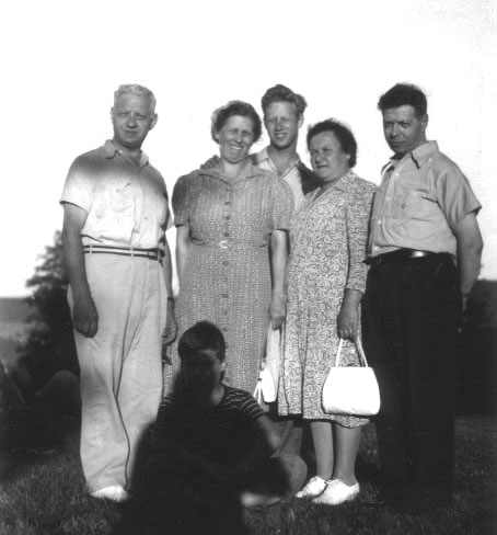
Date unknown, but possibly late-1930's.

Abner Graboff is in the back middle, with his parents on the left (his right). The other adults are unidentified. The boy in the shadow might be Abner's younger brother Ira, but it's hard to tell.


The family business, which had already been struggling through the depression, was dealt another blow by Joseph’s death of colon cancer at the age of 48… sometime during the mid 1930’s. Both my parents were heavily impacted by the depression and is some ways, were classic depression kids. When my father died, I found about a half dozen bank accounts with small amounts of money stashed in them. I guess he didn’t want to concentrate his wealth… in case any occurred… which it didn’t!

I’m not exactly sure when my father became interested in art, but he was apparently set on that path because he applied and was awarded a full scholarship to Parson’s School of Design in New York City after finishing high school. He told me that, at that time, Parson’s “wasn’t a very good school” and he transferred, with another full scholarship to another school where he completed his education. He told me that this school no longer exists and I don’t recall its name.

At the start of America’s involvement in WWII, dad took advantage of a draft deferment in light of the needs of the family business. He said that that was fine with him having no keen interest in entering the armed forces. However, as the war heated up and more and more men were being called into service, he told me that “it was a matter of time before he was drafted and thought that the best way to “have some control as to where he ended up”, was to enlist and request an area of service other than the infantry. He entered the army signal corps and, because of his background in art, was sent to drafting school and learned the “art” of drafting schematics for radios. After his army drafting school experience, he told me that it was his ambition for the duration, was “to never do anything army related again”. With the exception of being assigned the task of painting big white stars on the sides of jeeps for a day, he seemed to have successfully attained his service ambitions and a series of watercolor paintings, done overseas in England and France, resulted.

A side note to the star painting episode, my father said he couldn’t remember the formula for drafting a five pointed star and was scratching versions of it in the dirt when another soldier wandered by and asked what he was doing. This fellow knew how it was done and showed him, and Sergeant Eddie Rader of Brooklyn, New York would remain my father’s closest friend until the end of dad’s life.

After my father’s discharge, he met and three months later, married another East Orange native, Vivian Linde, started his career as a freelance graphic designer and raised 3 sons. Michael, born in 1951 and twins Paul and me in 1954.

Abner & Vivian 1945
Abner Graboff with wife Vivian (née Linde), 1945.

Ira, Vivian & Abner 1945
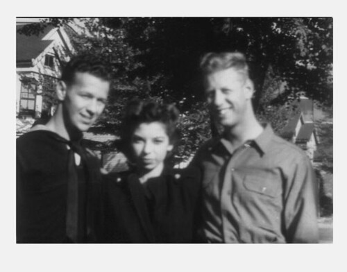
Brother Ira, wife Vivian, and Abner Graboff, 1945.

Twins Announcement 1954
Abner created this card, announcing the arrival of their twins Jonathan & Paul in 1954. The top part is the front of the announcement, and the bottom part is the back.

By the way, this is the first time it's being shown outside the family. Many thanks to Jon Graboff for sharing it with us!


Abner 1956
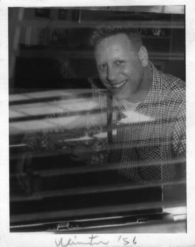
Abner Graboff in the Winter of '56. Looks like older son Michael in the shot (hard to see).

My 3 Sons 1959
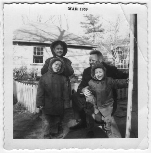
Abner with sons Michael (in back), and twins Jon & Paul.


W: Did he start in the commercial/advertising world right away, or did he do other types of jobs before working in that field?

J: I don’t believe that my father ever worked for anyone, preferring freelance work and I don’t recall my dad doing a lot of work in advertising. He was a bit of a left-winger and didn’t enjoy the corporate world… it reminded him too much of his army experience. I do remember a time when he had been offered a huge job for Dow Chemical in the late 1960’s. It was at the height of the Viet Nam war and Dow Chemical was the largest manufacturer of napalm which was being dumped in huge quantities all over southeast asia. He talked about feeling conflicted by his obligations as a breadwinner and his moral objections to war and warfare… he turned the job down.

He apparently did a lot of work in the early days of television when graphics were done on clear celluloid and scrolled in front of a camera lens. My brother Michael told me that dad mentioned to him that he had designed the CBS “eye” logo but didn’t receive credit for it. The credit went instead to the chief art director at the network. Perhaps I’m unduly influenced, but that logo does remind me of my father’s graphic style a great deal.

W: Are there any interesting stories that he'd tell you about his work?

J: Throughout my father’s career, he did hundreds of book jacket designs and I once asked him, in a slightly condescending way, if he enjoyed that kind of work? He said he loved it because he had to nail the vibe of the book in a single illustration and when he got it right, that it was very satisfying. There was a long period of time when I could walk into a bookstore, look around, pick up a book and look at the jacket design credit… and more often than not, find his name. Later on, I started to get fooled. Other designers were either copying or being heavily influenced by his style.

Graboff Jacket Designs
A collection of various dust jacket designs by Abner Graboff from 1957 to 1981. (Click on image to read details.)


The Hamburger Cook Book 4
The Hamburger Cook Book 5
The Hamburger Cook Book 7
From The Hamburger Cook Book by Esther K. Schwartz. 1950.


The Abelard Folk Song Book 03
The Abelard Folk Song Book 02
The Abelard Folk Song Book 04
The Abelard Folk Song Book 14
The Abelard Folk Song Book 07
From The Abelard Folk Song Book, 1958.


W: How did he make the transition from commercial artist to children's book illustrator? Did he do both at the same time?

J: There never was a “transition” from one area of my father’s career to another… it was all simultaneous. He never compartmentalized his design interests. As he got into children’s book illustration, he carried on with all the other work he was doing. One has to remember that he was a freelance designer with a young family and couldn’t afford the luxury of doing just one thing. Knowing him, I don’t think he ever wanted to do just one thing… he enjoyed it all.

I asked him why he stopped illustrating children’s books. He said he “had a bad agent and never made any money” doing them! He continued drawing these characters and they would turn up in letters, and book treatment ideas that never went any farther. When he died, I found something fascinating as I was going through the stuff in his office. My mother had told me that dad’s annual income could fluctuate by as much as a third depending on how much self-promotion he did… something he never felt very comfortable doing. Going through a file cabinet, I discovered files labeled with the names of art directors. I realized that when he wasn’t particularly busy, he would stockpile personalized cartoons, which he would slip into an envelope from time to time and mail to remind people that he was around and thinking of them.

W: One thing I love about your father's children's books is how radical a departure he took from what was considered the "norm" at that time during the 50's: he definitely did not do your typical "Dick & Jane" style of illustration. I'm curious, did your father ever mention who his influences were?

J: My father seemed to dislike complicated work. He’d say “too fussy”. He was drawn more toward artists who worked in bold strokes like Picasso (he liked his sense of humor), Braque and Miro’s later collages… and abstract impressionists particularly Kline and Rothko. He adored Rockwell Kent and I have a Kent illustrated copy of Moby Dick that dad bought when he was in art school and is dated in my father’s hand, 1940.

It’s hard for me to access his style as a “radical departure”… they were the books that were around as we were growing up and he was far too modest to crow about these kinds of things. I do have a friend who was doing some work with Maurice Sendak quite a few years ago. He generally described Sendak as intentionally oblivious to any other illustrators and claimed to be unaware of even the most well known ones. My friend happened to mention that he was heading into the city to meet me for dinner, and Sendak asked if I was any relation to Abner Graboff? Sendak astonished my friend by saying, “I wonder what ever happened to Abner Graboff… he was really good”.

Mr. Angelo 1
Mr. Angelo 4
Mr. Angelo 5
Mr. Angelo 9
From Mr. Angelo, 1960.


I Know an Old Lady 6
I Know an Old Lady 5
I Know an Old Lady 7
From I Know an Old Lady, 1961.


W: I love the stylization of his characters, the way he used simple shapes and color to create sophisticated compositions. Do you happen to know what materials he used? Cut paper? Ink? Pencils?

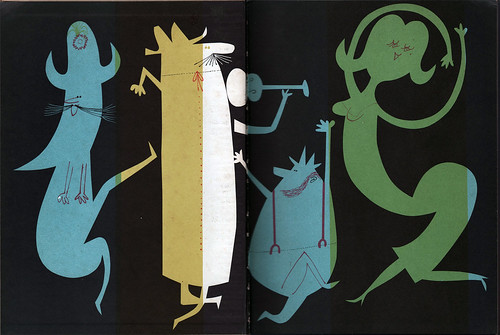
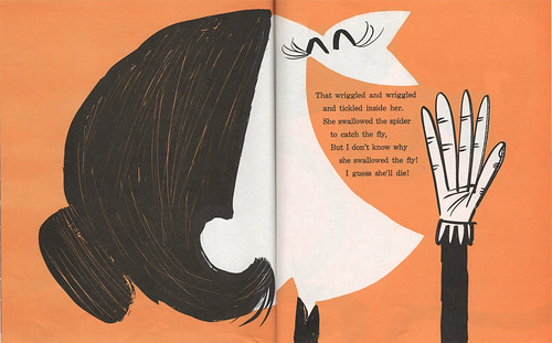
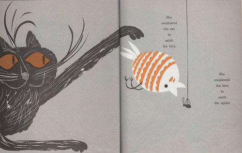
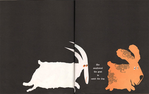
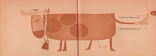
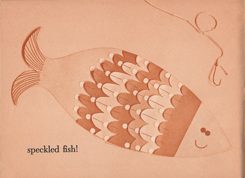
J: Dad used just about every medium in his work. Pen and ink, felt markers, cut paper (even cut sandpaper), string, toothpicks, leaves and what ever else was on hand. He was the first illustrator that I know about who would build a character out of paper and let it float over a background and photograph it using a single, hard light source to cast shadows so it appeared three-dimensional on the printed page. “Do Catbirds Have Whiskers” is a good example of this.

Do You Want To See Something? 1
Do You Want To See Something? 6
Do You Want To See Something? 9
From Do You Want to See Something?, 1965.


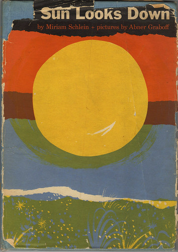
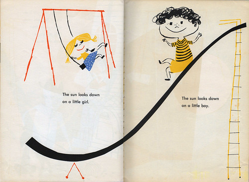
W: As mentioned before, I have what was listed as the first children's book he illustrated, "The Sun Looks Down", done in 1954. How many books did he illustrate that you know of?

J: Below is a list of my father’s books that I compiled from the Internet. I’m not sure if it’s complete or not:


Books Illustrated by Abner Graboff


1954 The Sun Looks Down, by Miriam Schlein, pictures. by Abner Graboff. Abelard-Schuman.

1956 Rainbow In The Morning, by Carl Withers, pictures. by Abner Graboff. Abelard-Schuman.

1957 A Tale Is A Tail, by Katherine Mace, pictures. by Abner Graboff. Abelard-Schuman.

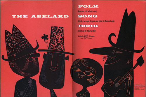
1958 Abelard Folk Song Book, by Norman Cazden, pictures by Abner Graboff. Abelard-Schuman.

1958 I Want To Whistle, by Anne Alexander, pictures by Abner Graboff.

1958 The Daddy Days, by Norman Simon, pictures by Abner Graboff. Abelard-Schuman.

1959 Of Course, You’re A Horse!, by Ruth Shaw Radlauer, pictures by Abner Graboff. Stella Greenwald.

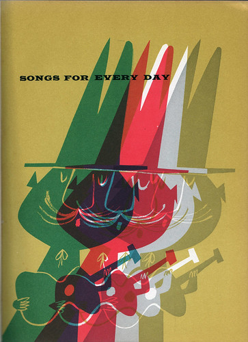
1959 Merry Ditties, (song book for piano and guitar), by Norman Cazden, pictures by Abner Graboff. Bonanza Books.

1960 Something For You, Something For Me, by Mabel Watts, pictures by Abner Graboff. Abelard-Schuman.

1960 Noise In The Night, by Anne Alexander, Pictures by Abner Graboff. Rand McNally & Company.

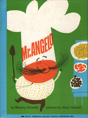
1960 Mr Angelo, by Marjory Schwalje, pictures by Abner Graboff. Abelard/Schuman.

1961 Please Don’t Feel Horace, by Miriam Young, pictures by Abner Graboff. A Dial Junior Book.

1961 I Know An Old Lady, by Alan Mills, pictures by Abner Graboff. Rand McNally. Scholastic Book Services.

1962 Weeks And Weeks, by Mabel Watts, pictures by Abner Graboff. Abelard-Schuman.

1963 A Fresh Look At Cats, by Abner Graboff. F. Watts

1964 The Hungry Goat, by Alan Mills, pictures by Abner Graboff. Rand McNally

1964 No Sort Of Animal, By Mary B. Palmer, pictures by Abner Graboff. Houghton Mifflin.

1965 Heat, by Howard Liss, pictures by Abner Graboff. Coward-McCann

1966 Mrs. McGarrity’s Peppermint Sweater, by Adelaide Holl, pictures by Abner Graboff. Lothrop, Lee & Shepard Co,, Inc.

1965 Do You Want To See Something?, by Eve Merriam, pictures by Abner Graboff. Scholastic Book Services.

1967 Do Cat Birds Have Whiskers? By Abner Graboff. G. P. Putnam’s Sons

1967 Willie & Winnie & Wilma The Wicked Witch, by David C. Whitney, pictures by Abner Graboff. Franklin Watts, Inc.

1968 Skippy The Skunk, by David C. Whitney. Pictures by Abner Graboff.

1968 Would You Put Your Money In A Sand Bank?, by Harold Longman, pictures by Abner Graboff. Rand McNally & Company.

1968 Crystal Magic, by Eugene David, Pictures by Abner Graboff. First Cadmus Edition.

1969 Limpy The Lion, (See and Say Sounds Series) by David C. Whitney. Pictures by Abner Graboff. F. Watts

1969 Old Macdonald Had A Farm, by Abner Graboff. Scholastic Book Series.

1969 It’s A Picnic!, by Nancy Fair McIntyre, pictures by Abner Graboff. NY Viking

1969 Ann’s Ann-imal, by David C. Whitney, pictures by Abner Graboff. Watts.

1975 Do You What I See? No! I See Something Else, by Abner Graboff. Scholastic Book Series.

1976 In A Cat’s Eye, by Abner Graboff. The Bookstore Press.

This is the end of Part 1 with my interview with Jon Graboff.

-----------------------------------


Next: The Art & Life of Abner Graboff Part 2
Previously: Who was Abner Graboff?

You can see more of my scans of Abner's books in my Abner Graboff Flickr set.


6.29.2009

Who Was Abner Graboff?

The Sun Looks Down


Abner Graboff is one of those artists who's fallen through the cracks of time. An enigma, if you want to call him that. Not a whole lot written about him, and what little there is, well, there's not much to glean from. I first found out about him through my Flickr group, The Retro Kid. On there, illustrator Eric Sturdevant had posted some fantastic pages from several of Graboff's books. I immediately made a mental note to remember this artist and his brilliant use of shapes and color, as well as overall design. Soon afterwards, I stumbled upon a book written by Miriam Schlein and illustrated by Graboff titled, "The Sun Looks Down". The dust jacket was literally falling apart, but still somewhat intact. Reading the inside back flap, I found a brief bio for the artist:

ABNER GRABOFF is a young artist, well-known in the field of commerical art, who makes his bow to the world of children's books with his pictures for "The Sun Looks Down".

When asked to tell the publisher something about his hobbies, Mr. Graboff said his only hobby was painting. The fact that he enjoys his work shows clearly in the humor and wit and careful attention to detail in these pictures.

Miss Schlein worked closely with Mr. Graboff when his pictures were still in the planning stage and feels that he has caught her mood perfectly.


The copyright for the book is dated 1954. Here are some spreads:

The Sun Looks Down 2
The Sun Looks Down 3
The Sun Looks Down 4
The Sun Looks Down 5
The Sun Looks Down 6
The Sun Looks Down 7
The Sun Looks Down 8

Notice how Graboff utilizes the space in each spread. I'd like to contribute this to his background in design. He was listed as designer and artist for a few notable ads featured in graphic design annuals around the time, but I couldn't find much more on him. There's no way of telling if Abner started in graphic design and then moved onto children's books, or did the books as an aside, or how long he illustrated children's books, etc. The inside dust jacket of "Sun Looks Down" didn't really tell me anything, save for the fact that he was known for his commercial work and that this was his first book.

Well, now we can know. Even though Abner passed away in 1986, I was able to contact his son, Jon, and ask him a few questions about his father's life and work. Jon Graboff is an established musician and producer, having played with Ryan Adam's band, The Cardinals, among a wide variety of artists. Jon took time out of his busy schedule to answer my questions, most of which probably bordered on fan boy obsession. I'm forever indebted to Jon for doing this for me, as well as for the multitude of current Abner Graboff fans who've longed for more information about this intriguing artist who's touched so many lives with his lively body of work.

Throughout this week I'll feature the interview as well as showcase some books that Abner had illustrated throughout his career. Stay tuned!

Next:
The Art & Life of Abner Graboff: Part 1 of my interview with Jon Graboff. Jon shares some fascinating stories, along with family photos.
The Art & Life of Abner Graboff Part 2

More on Abner can be found here:
My Abner Graboff Flickr set
Abner Graboff in The Retro Kid
Abner Graboff on Biotope (Japanese site)

6.23.2009

Terrible Yellow Eyes

For Terrible Yellow Eyes

I'm sure you've heard of Terrible Yellow Eyes by now, right? If not, please click on the link to visit Cory Godbey's wonderful tribute site. His words:

Terrible Yellow Eyes is a collection of works inspired by the beloved classic, Where the Wild Things Are by Maurice Sendak....We share a love and admiration for Sendak's work and the pieces we present here are done as a tribute to his life and legacy.


I want to thank Cory for coming up with this great idea. And I want to thank him for allowing me to be a part of it. Above is my submission.

And, of course, I want to thank Mr. Sendak for being so wild as to create such an inspirational bit of children's literature.

6.19.2009

And the Winner Is...

It's here!

#159: H. A. Weaselton


CONGRATULATIONS, H. A.! You win a signed copy of my new children's book How To Train With a T. Rex And Win 8 Gold Medals, as well as a 5x7 print of your choosing from The Ward-O-Matic Shop. Take a look around, see what you like. Choose wisely, my friend.

THANK YOU ALL for participating in this book giveaway, guys. Wish I could give a copy to each and every one of you all who commented here. I had a lot of fun working on the book—it's a great pleasure for me to finally share it with everyone out there. Be sure to come back to check out some work-in-progress stuff I did for the book, like rough sketches and drawings. I think you'll find it interesting. At least, I hope.

-----------------------------------


Coming up: I'm very excited about this one post I've been working on, featuring an interview with the son of an influential illustrator from the 50's - 70's. Stay tuned!

6.15.2009

Take a Look Inside the Book (and a Giveaway)

Now that the veil has been lifted, allow me to show off what I've been keeping under wraps since January. Yes, a bit of self-indulgence, but this is my very first children's book and I CAN'T HELP MYSELF! I'm extremely excited to share with you all some spreads of How To Train With a T.Rex and Win 8 Gold Medals. If you like what you see, why not click on the book title and order it? It'll make me happy. And my family. We're counting on you. No pressure.

(However, if you want a freebie, I'm offering a BOOK GIVEAWAY further down in this post!)

Allow me to take you on a visual tour of the book:

How To Train With a T. Rex: front cover
Holding up the cover, you can see the gold foil lettering and gold medals. Looks pretty cool, I think. Hard to photograph, though.

How To Train With a T. Rex: back cover
I like what my art director did with the back cover here. Lucy took what I had drawn for page 5 and put it on the back. Nice.

How To Train With a T. Rex: spine

How To Train With a T. Rex: Title pages
I like how this spread looked. Simple and basic.

How To Train With a T. Rex: pages 4-5
The dog is Herman, Michael's very own pet bulldog. I looked at pictures and video that was available of Herman (not much actually) and tried to match the color patterns found on his coat.

The audience on the right was a pain. I didn't want it to look like I just drew 10 shapes of people and copy pasted the heck out of it. I really went in and drew and touched up almost every single "person".

How To Train With a T. Rex: pages 6-7
This was a fun spread, showing the relative time it took for Michael to train leading up to the Olympics (it goes to 2003, but who's counting). We decided to go with a boy growing up, alongside his pet bulldog, from birth to six years old. Even though it's not really Michael here, I made it look like the kid's really into swimming (he reads a book called "How to Swim Like a Dolphin", for instance).

How To Train With a T. Rex: pages 16-17
The whole eating up to 10,000 calories thing is fascinating to kids, so it was fun to visualize the fact that it would be like eating tons of pizza. Of course, eating just pizza would be sorta not healthy, so that's why you see a "I could never eat that much pizza!" line.

Easter Egg alert: the name of the pizza delivery service is "Ava's Pizza".

How To Train With a T. Rex: pages 20-21
When in doubt, DINOSAURS! I had a blast drawing this spread—I mean, who doesn't love T. Rex's and Velociraptors?

I was *this* close to putting my graffiti tag on that subway car.

How To Train With a T. Rex: pages 28-29
Wrapping it up. Getting near the end of our journey, as we recap all the things that Michael had to endure to reach his goal at Beijing.

Phelps/Jenkins
Okay, one more shot.

------------ BOOK GIVEAWAY!!! ------------


Now that the book is officially released, I'm going to celebrate by offering a signed copy of the book! (Sorry, not signed by Michael, just me.) I'll make it even MORE worth your while by throwing a 5x7 print from my Etsy shop into the mix. How's that? Yeah? Yeah!

Okay, what you need to do is leave a comment on this blog post by midnight (PST) Wednesday, June 17 and I'll have one of my kids pick a number out of a hat. The winner will be announced this Friday, the 19th.

GOOD LUCK!


UPDATE: Comments are now closed. Thanks for participating, guys!

6.12.2009

How To Train With a T. Rex and Win 8 Gold Medals

How To Train With a T. Rex and Win 8 Gold Medals

It's here!


It's official, guys: my very first children's book that I illustrated is now available: How To Train With a T. Rex and Win 8 Gold Medals. I had so much fun working on this book, thanks in part to art director Lucy Cummings and editor Alexandra Cooper at Simon & Schuster. Those two made the project worthwhile for me as I was neck-deep in deadlines and redos. It was a great pleasure to work with such fine people. Thank you, Lucy and Alex!

It feels so good to finally talk about this thing! I'll post a couple of shots of the inside of the book later on this weekend, so be sure to check back later. I'll even talk a bit about the making of some of the spreads, including sketches. I promise it'll be fun.

A big hug goes out to my wife Andrea, and to Ava & Ezra for being patient with me during the months it took to complete the book. I am nothing without you guys.

And one last thing: a big thanks to all of YOU for being so supportive of me! The love & support from family, friends and fellow artists goes a long, long way, believe me. Thank you.

6.08.2009

FTW! WTF?

FTW! WTF?

Just an idea I had hanging out in the confines of my brain. For the record, I had no idea what "FTW" meant until several months ago. And really, I thought it was just a funny way to say "WTF" but backwards. Oh, nevermind.

6.07.2009

Forcing Myself to Contradict Myself

Realizing it's been a long time since I've posted anything from my sketchbooks. So here's a sampling of some pages below. You can click on each image to go to a slightly larger version on its Flickr page. If you'd like to see any one of these even larger, let me know and I'll put a link up for you. Sorry that I don't make these images large in the first place, I'm just a little wary of posting high res scans of my artwork. Hope you understand!

sketches 1

sketches 2

sketches 3

sketches 4

sketches 5

sketches 6

sketches 7


Andrea and I watched a documentary on photographer Annie Leibovitz last night. Here's a quote from her: "The camera makes you forget you're there. It's not like you are hiding but you forget, you are just looking so much."

When I draw and sketch people and places around me, I lose myself in the process. Even though I have a certain knowledge of how to start each sketch or drawing, it's still a surprise to me how it turns out. And when I look through my past sketchbooks, I'm constantly surprised by the results I see on each page, each drawing. And I can remember the process I took for each drawing: from how I approached the subject, all the way to its completion. It's a funny way of looking at your work, and I like it. It's good to be surprised by your own work—that way, you know you'll never do something the same way twice. At least, that's how I look at it.

I might've mentioned it here on the blog before, but it's worth the mention again: one of my favorite artists of all time is Marcel Duchamp and there's a quote that's attributed to him that pretty much sums it up for me and how I look at what I do as an artist:

"I have forced myself to contradict myself in order to avoid conforming to my own taste."

I guess you could say that I have a fear of repeating myself. Even though I might approach each drawing differently, I know that my overall style comes through, creating an overall artistic signature, or 'voice', that can't be denied. The end result might look similar to the viewer, but, I know personally, I took the 'road less traveled', and that my artistic journey was one of newness and wonder with each page, each drawing.