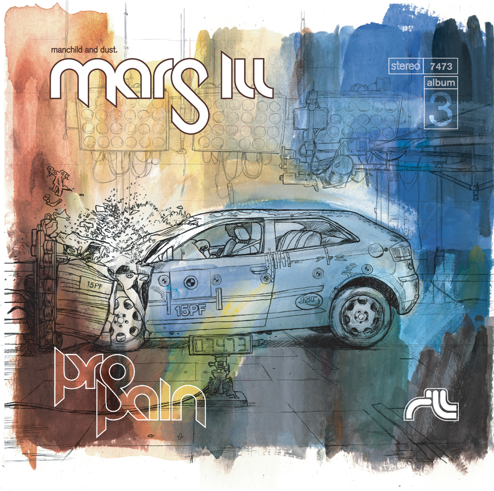
But why am I talking about all this here? Well, I think you might know who did the artwork for the cover:
Click on image to view larger.
Yup, I did all the artwork that you see on the CD packaging. In fact, I've had the great privilege of doing artwork, photography and graphics for Mars ILL since their genesis in 2000. Mars ILL consists of one DJ and one MC, Dust and manCHILD. Dust is my brother-in-law, Andrea's younger brother, Nate (so you see the connection there). Nate is a true artist in all sense of the word — not only is he an artist on the wheels of steel, but he's also well versed in the visual arts world. He's good when it comes to coming up with a concept for something and knowing if it will work or not. He knows his audience and he knows that they don't want to see the typical rap garbage that others are so prone to doing. I've worked with Nate on three albums so far (along with the occasional print ad or photo shoot here and there) and we have never done the same thing twice. When we work together, Nate acts as art director and I do all the footwork. He'll come up with the initial concept and I simply act as the vessel to produce the final product. Out of all my years in working in the visual arts, never have I had a more comfortable working relationship than with Nate Corrona. He's open to any fresh ideas that I may present to him and is very willing to listen to any thoughts or concerns that I feel might need to be addressed. It's very refreshing to experience a working partnership like this. And boy, do I know what a rare thing that is.
Regarding the cover and concept for ProPain: once the album title was established (thanks to a Mars ILL fan), Nate came to me and said that he had this idea of using an image of one of those car test crashes and he had some images that he found for reference. There were several shots that we liked that had just the right amount of glass and metal shards coming off the vehicle, but we didn't want to use one in particular for fear of copyright infringement (irony notwithstanding). So I cobbled together this grand image of a car hitting a barrier with bits and pieces from various different car test crashes. I dubbed this final image the "Frankencrash." I then took the Frankencrash into Painter and drew over it with an altered brush that made it look like it was graphite pencil on paper. The sad thing is, I really got into drawing all the details, so much so that I probably could've spent several more days on it. Boy, am I a geek.
Next, I painted the background with real paint (gouache, of course) and scanned it in and tweaked it to make it fit with the Frankencrash image. Nate was cool with using real paint — he had seen some of my other painted pieces and wanted that painterly look throughout the entire album. My initial response to him was: "Are you sure?" Pencil drawings over somewhat abstract gouache paintings does not speak "hip-hop" to me. But hey — this was Nate's gig and I wasn't gonna question his authority on this. Needless to say, I was very honored that he wanted to use my paintings for the project.
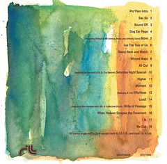 The rest of the album's artwork was going to be inside the CD booklet, a folded four-panel deal that would be basically eight, if you count front and back. We had done this before for the group's previous effort, "Backbreakanomics," with most of the panels filled with liner notes and track info for the obsessive fan to read over and over.
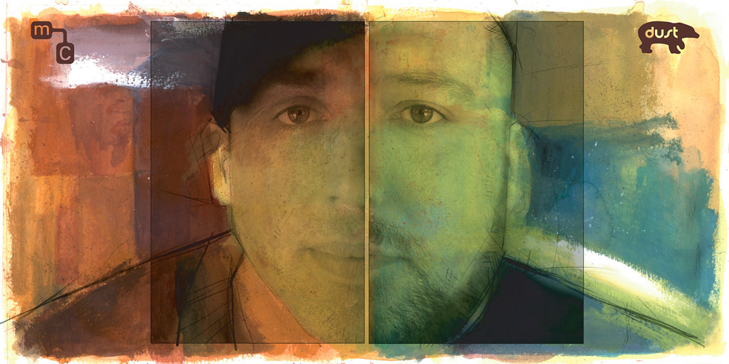
Continuing with the concept of using real paint, I thought it would be kinda cool if each panel of the booklet would basically be its own separate piece of artwork, as if you were standing in an art gallery, casually looking at paintings on the walls. So I painted five other pieces that would fit within each 4.75 x 4.75 inch panel, with two of the pieces being two panels wide each. One of these images was a manCHILD/Dust portrait, shown below:
Again, click to view larger.
Here, I took a photo that local photographer, Zack Arias, had shot and put together himself and I then superimposed it over my painted background.
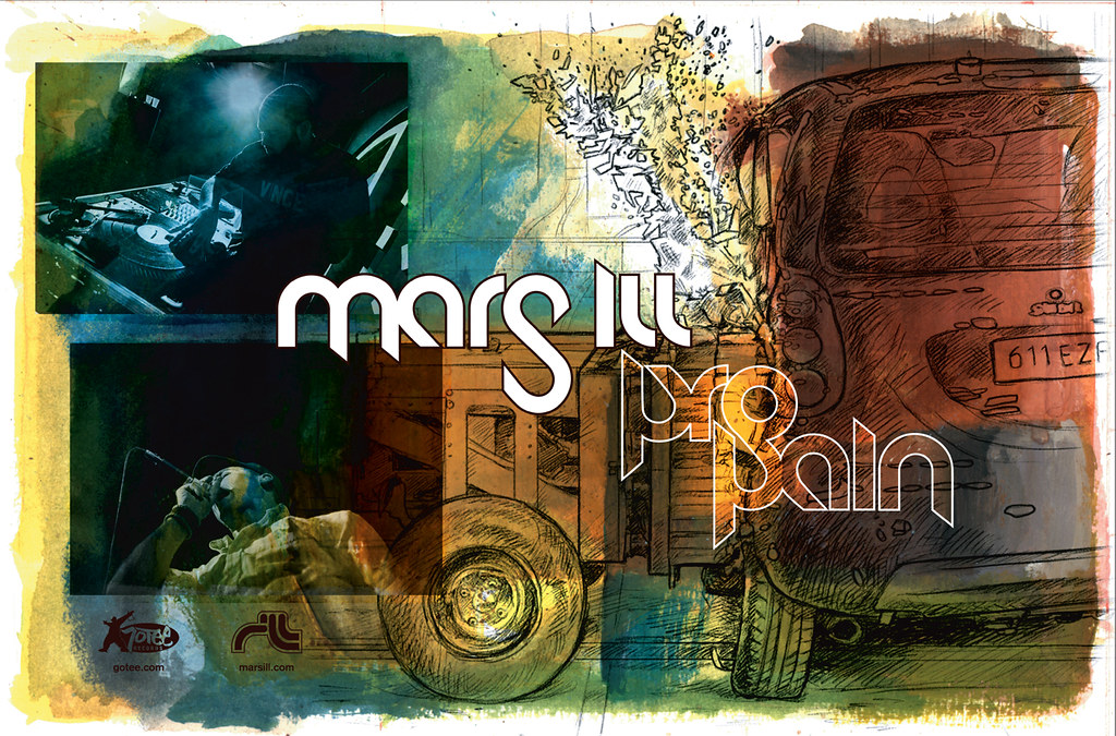
The rest of the "gallery" is just abstract watercolor-ish paintings that serve as backgrounds for all the wordage to go over. However, we had enough space to do another 2-panel collage, using photos by Zack superimposed with another drawing of a car crash. I was very happy with the way this piece ended up, and so Nate used it for one of their promotional posters. You can see the poster below. Be sure to click on it to view it larger:
ProPain was a major undertaking for me. (My "ProPain" file took up over 4 GB of memory in my Powerbook.) Even though it was a load of work to do, I was surprised at how well everything came together. And pretty quick, too. I guess after working with Nate for six years (and knowing him for 11 more), we're to a point in our working relationship where we both know what to expect from each other and can get the job done a lot sooner. At least that aspect of ProPain was relatively painless.
And now, I suggest you go buy a copy of ProPain so you can own a little bit of Ward Art (and Dust Music) for yourself. To read more about the story behind the delayed release of the album, be sure to read Lulu's take on the whole deal. She should know just a little more than me about it — she's Dust's wife.
thank you, ward, from nate and I, for not only your continued support of all things mars ill, but for all of your hard work and encouragement, late nights up meeting deadlines, and just general brotherly love : ) we are so excited the album is finally out there available to anyone who wants a fresh perspective on music. hurray!
ReplyDeleteVery nice man... you always seem to do amazing work and your part of Pro*Pain was very much worth seeking out the album... the whole thing is amazing, artwork, music, everything...
ReplyDeletethanks for all you do, and thanks for sharing it with us...
peace... love... bdg...
Looks tight Ward. Very nice.
ReplyDeleteYou might be right that "pencil drawings over somewhat abstract gouache paintings do not speak hip-hop" but then that has nothing to do with the music, really.
I for one love to see well designed hip-hop album designs which break from the cliches. They are a comparitive rarity (Boom-Bip's excelent sleeves come to mind), which of course works in Mars Ill's favor. Standing out on the rack is what it's all about.
In any case it looks great. Congrats.
This looks really delicious. I have one question: what settings did you use in Painter to simulate a decent graphite pencil effect? This has been driving me crazy for years, and you look like you got it there. Can you please reveal the secret?
ReplyDeletezoe, I have Painter 8 and I was using the "Grainy Pencil 5." Opacity: 12% and Grain: 22%
ReplyDeleteIt also helps to use the Wacom tablet to get the pressure sensitive feel to the pencil. That's what I used for ProPain.
Thanks, jmorrison for your comment. I whole-heartedly agree with the notion that well designed hip-hop albums break from cliches. That's what Nate wants -- something that does not scream it and makes you think outside the proverbial box of hip-hop.
Thanks all, for your kind words! I'll show more from the other albums soon.
Ward.
ReplyDeleteBeautiful work :)
I saw Mars Ill at one of the WRAS benefits and love their music..
Thanks so much for sharing :)
Signature Ward colors. I saw this when he was working on it!!! Nanny-nanny-boo-boo!
ReplyDeleteThe art work looks fantastic. Way to go.
ReplyDeleteThat's solid through n' through, man!
ReplyDeleteI gotta ask...for the Raw Materials release, did you tag that mailbox?
I'm not out to bust you, I've just always dug that. :) It looks like it was done with Krink.
Ward - I feel like I am on an episode of Lost. Mars Ill & DeepSpace5 are my favorite bands and you are my favorite blog dude. The fact that you do the art BLOWS MY MIND! ProPain is a fantastic design and works well with the music. I still cannot get over this connection. Man-Child and Dust are incredible artists and I discovered them a few years ago. Keep up the best blog ever and the great work!
ReplyDeleteDude your art is sick. I was checking out a group on
ReplyDeleteVIRB and i thought "hey that looks like the pro pain cover. I should link to it for comparison." Low and behold the first link I click on is yours. Beautiful work. A perfect compliment to the music.
I am too tied up with university assignments to read the entire post but your animations are fantastic. I really like the photo-superimposed one.
ReplyDeleteClassy stuff. I should look out for your blog.